Artwork 1
Artwork 2
Artwork 3
Sunday, May 22, 2011
Wednesday, May 18, 2011
Monday, May 16, 2011
Animation
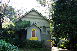
I had a lot of trouble with animation. I researched it a lot and found that most was not what I wanted to do. I wanted something simple that portrayed my theme of colour. At first i looked at doing something with coloured pencils or pastels, but it was too lifeless and I did not think it went well with my other artworks. In the end I decided to play a round with some of my photographs. I took this one photo of a coloured doorway of a church which I really liked. I used this photo in photoshop and made it black and white and made the colour of the door multiple colours. I then took photos of each photograph with the new colour door. I then put all these together and created my stop motion.
Tuesday, May 10, 2011
Drawing + Painting
This week we were experiement with Coral X painter which was really fun to use. I enjoyed the digital side of drawing and painting, but did miss the texture of real art. I chose to use a photograph of a cottage with a bright red door. I really like the photo because it calls on the viewers imaginiation to think about where the door leads to, who the cottage belongs to and the story that goes with it. I tried a lot of different effects and this is them:
 |
| I used the Acrlyics dry brush for this one. I like the cloudy affect of it, but I think it could show more texture and look more like a painting. |
 |
| I used coloured pencils for this one, which I really like. I think the texture is great, but am unsure if its too blurry. |
 |
| For this one using chalk textured I thought it looked similar to the coloured pencils, but it had some strange spots on it which I think draw to muich attention to. |
 |
| For this one I used the sponge dense brush. I think it has a really cool affect and is one of my favourites. |
 |
| I used the watercolour broad brush for this one. It has very thick strokes which I like, but I dont like the strokes on the door. |
 |
| I like the soft chalk brush used in this one. I think the strokes are really good and work well as a whole digital painting. |
 |
| For this one I used the gouche thick flat brush which I think has'nt done much except make the photograph look a bit clearer. |
 |
| I used pastel chalk for this photograph. I like this photo and think it has some really nice strokes. |
 |
| For this one I used the soft watercolour brush which I think just made a blurry photograph. |
Thursday, May 5, 2011
Video Art
For this week we are working on video art. I find video art a hard thing as it has to portray a message, but also be clasified as art. I think art these days is seen as anything, but it still has to appeal to the viewer and a particular audience. When looking at videoartworld I had trouble finding something that I really liked. This is one piece that I liked:
http://videoartworld.org/ It was called "canvas" by Katja Kollowa.
http://videoartworld.org/ It was called "canvas" by Katja Kollowa.
Thursday, April 7, 2011
Collage + Mount Dandenong
I really enjoyed researching collages because of the use of mixed media and the 3D effect. I have always enjoyed making collages because of the image you can create just by cutting and pasting. I also love the look of mosaics which can be done digitally these days. During class my favourite collage we were shown was 'Pearlblossum Hwy' by David Hockney. These are some other collages I also found that I liked:
Mount Dandenong
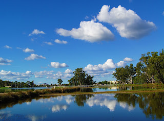
I went out the other day to take some photos of some landscapes/scenes that had a colour that really stood out. I went to Mt Dandenong because I love all the cottages and the rainforest as a background. I found some places that had coloured doors, signs and windows. I really like these photos but think I would need to do some editing to make them more brighter, vibrant and so that the colour in focus stands out more. I think these are some of the type of photos I will use for my digital collage as they are good back ground photos, but also have various items I could combine into this artwork.
 |
| David Hockney 'Pearblossom Hwy, 11th-18th April, 1986, #2' 1986 |
 |
| Bell Vance 'The bawdy house on petticoat lane' from http://www.bellvanceart.com/collage.html |
 |
| Jen McCleary 'Digital Collage' from http://jenmccleary.com/2009/01/digital-collage/ |
All accessed on wednesday 6th of April 2o11.
Mount Dandenong
I went out the other day to take some photos of some landscapes/scenes that had a colour that really stood out. I went to Mt Dandenong because I love all the cottages and the rainforest as a background. I found some places that had coloured doors, signs and windows. I really like these photos but think I would need to do some editing to make them more brighter, vibrant and so that the colour in focus stands out more. I think these are some of the type of photos I will use for my digital collage as they are good back ground photos, but also have various items I could combine into this artwork.
Wednesday, April 6, 2011
Photographer I like + My first photos edited
An artist I like
Since studying photography I have had the change to reasearch a lot of photographers and find some I really love. One person I was happy to find was Jennifer Zwick. I really liked her series on Narratives and the story and creativity they hold. I think all photos should tell a story, capture a moment or be a memory for the viewer to remember. I like Zwicks Photographs because they remind me of childhood and the never ending imagination we have at that age. One of my favourites is 'The Reader' beacause it reminds me of my love for reading and how you can get lost in a book. All of this series are really cool and I think draw the viewer in to remember and remenis on the crazy things you did and believed in. These are my potographs from the series:
For all of these photos I pretty much changed the vibrance levels. However I also changed some of the colour levels, brightness and contrast. I love the difference when you just change the vibrance of a photo it brings out all the colours so much more. For the last two photos I cropped them because I thought there was a lot of negative space.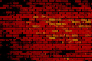
Since studying photography I have had the change to reasearch a lot of photographers and find some I really love. One person I was happy to find was Jennifer Zwick. I really liked her series on Narratives and the story and creativity they hold. I think all photos should tell a story, capture a moment or be a memory for the viewer to remember. I like Zwicks Photographs because they remind me of childhood and the never ending imagination we have at that age. One of my favourites is 'The Reader' beacause it reminds me of my love for reading and how you can get lost in a book. All of this series are really cool and I think draw the viewer in to remember and remenis on the crazy things you did and believed in. These are my potographs from the series:
 |
| Jennifer Zwick 'The Dream' 2007. Accessed on the 6/4/11 at http://www.jenniferzwick.com/work/photography/constructed-narrative/the-dream |
 |
| Jennifer Zwick 'The Explorers' 2005. Accessed on 6/4/11 at http://www.jenniferzwick.com/work/photography/constructed-narrative/the-explorers |
 |
| Jennifer Zwick 'The Reader' 2005. Acessed on 6/4/11 at http://www.jenniferzwick.com/work/photography/constructed-narrative/the-reader |
My first edited


Subscribe to:
Posts (Atom)


